.png)
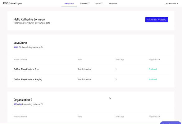
Foursquare Dev Console
Improve Billing Transparency to Reduce User Confusion
Contribution: Lead Product Designer
Date: Q4 2022
Skills and Tools: Competitive Analysis, Interviewing, Site Mapping, Prototyping, Figma
The Problem
Users have expressed confusion and lack of awareness about the free credits they receive in the Developer Console and how to check their balance. This has resulted in a pain point for users and a need to improve billing transparency in the product.
Our Solution
The proposed quick win solution is to educate users about API billing and the free monthly $200 credits they receive per Org. This was achieved by showing the user's remaining balance directly on the developer console's landing page accompanied by a tooltip that clearly and concisely explains how the free credits work. We increased users ability to understand and find billing information by +30%. We also increased the number of users knew they were receiving free credit on a monthly basis for their organization by +56.7%

Final design (click to view)
The Process

01
Understand the Problem
Background Research
Foursquare's developer console gives users access to the Places API. This API allows users to get real-time data access to global POI data and rich content such as search, discovery, and the ability to rank venues.
The initial problem we are solving came to the design team after we conducted a developer survey to understand the pain points and needs of the users. One of the issues that emerged from the research was a lack of billing transparency, with multiple users expressing confusion and frustration about the free credits and how to check their balance. Some users indicated they were not aware that either of them existed.
.jpg)
.jpg)
What are free credits?
Foursquare gifts users $200 worth of API credits on the 1st of every month for each organization you have - not for each project. A project is part of an organization. You can have multiple projects under an organization. Once you use the credits credited to your organization, you'll need to purchase more credits.
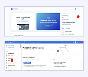
Competitive Analysis
To assess/benchmark how Foursquare handles billing in comparison to peers & competitors, I conducted a competitive analysis of other Developer Consoles.
It was clear that our billing page button was buried multiple clicks away (3) compared to our competitors (1), making it difficult for users to find it. Putting the billing page under the organization section made it less clear to the users how to get to the billing page because that information was never made clear to the user.
Competitors (click to enlarge)
.png)
Foursquare (click to enlarge)
02
Design Process
Site Map
I created a site map to gain a better understanding of the overall structure of the product and highlight potential issues such as deep linking the billing page. This also served as an important tool for communication with stakeholders and team members, helping to ensure everyone is aligned on the current structure of the site as well as the goals of the product moving forward.


Site Maps (click to enlarge)
Iterating
It was important to explore both high and low effort options to have a vision as to how our product might evolve and meet user needs over time. I discussed these options with stakeholders as well as other designers in the company to get their input and ensure that we were considering all possibilities. I conducted a few rounds of user testing to narrow down the options.
By iterating on both high and low effort options, we were able to explore different solutions and trade-offs, such as balancing user needs with technical feasibility and resource constraints. This allowed us to make informed decisions about which features and improvements to prioritize and pursue, and helped us to create a roadmap for the product that aligned with our users' needs and our business goals.
Iterations (click to view different iterations)
04
Design
High Fidelity Design
After our iterations, we felt comfortable with our final solution.
-
We visually communicated to users their remaining balance to simplify that credit remaining is for the overall organization and not a single project.
-
Users can get to the billing page with one click. We want our users to easily accomplish their goals when using our product.
-
The tooltip makes users aware of how the free credits work.
-
We did this with a quick low level-of-effort design that benefits the users and the business.
Final design (click to view)
Conclusion
This was a great project to work on as we continue to improve the customer experience. We have received positive feedback from admin developers who can more easily find and understand billing and credits on our console. The design is cohesive for new users and those who didn't have billing access (manager or viewer) as well.
-
93% of users understand and can find billing information +30%
-
82.7% of users knew they were receiving free credit on a monthly basis for their organization +56.7%