.png)
Lupita's Corner Market
A new website design for a local family-owned small business.
Contribution: UX/UI Design
Length: 8 months
Skills and Tools: Competitive Analysis, Interviewing, Think-Aloud, Storyboarding, Experience Prototyping, Figma
The Problem
Lupita’s Corner Market has lost 80% of its business due to the pandemic once the high school and elementary school that made up a majority of their customers had to close down. The challenge is to design a new website to help increase business and engagement with the Westlake neighborhood and the greater Los Angeles community.
Our Solution
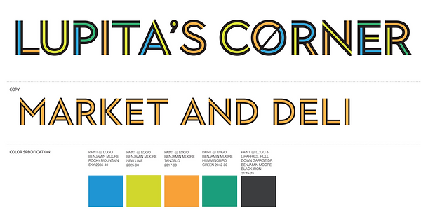
We designed a clean, minimalist, and modern website by integrating Lupita’s Corner Market’s new brand identity - a fresh and vibrant market for the community with a farmer’s market feel. We combined the market’s new logo, signature color palette, and vibrant images of the market’s offerings with a simple user flow.

Click to pay
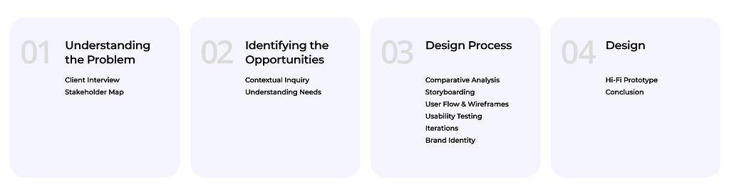
Our Process
.png)
04
01
02
03
01
Understand the Problem
Client Interview
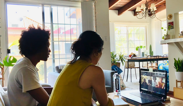
We started the design process by meeting the client, Luz Arango, at the store to talk about her needs for the website. The market had recently undergone a renovation and started offering healthy and freshly made food options that previously were not available in this area of LA. During the interview, we had the opportunity to observe Luz on a typical workday as she helped us define her primary and secondary goals for the website.
%202.png)


Stakeholder map
After talking to Luz and understanding her goals and her target audience for the website, we created a stakeholders map to identify those who will be impact by the design.
The primary users of the website are young individuals in their early 20s and 30s who are currently working from home and live in the neighborhood. There is also an opportunity to reach more potential customers since the market has already been active on social media and gaining more attention.
02
Identifying
the Opportunities
Contextual Inquiry

Once we defined our primary users, we conducted contextual inquires by accompanying them as they shopped at Lupita's. The process informed us about why they currently shop at the store, their pain points, and what would encourage them to use the store’s website. Below are our key findings.
We learned that customers want easy access to the deli menu and other products in the market, which could help increase profits for the store.
Since Lupita’s is now offering call-in orders for pick-up, this website could create a safe way for customers to order food and pick up during COVID. This is especially important for those who are driving since parking is difficult in this area.

Understanding the Needs
After better understanding the customers needs and behaviors we put together our notes of the most important needs and wants from the client as well to compare and better validate what we should focus on when creating the website.
%201.png)
03
Design Process
Comparative Analysis
We decided to do a comparative analysis of similar local small businesses to understand how they structured their websites. The two are examples of some we thought were successful because of the simple and clear navigation and how they tie in their distinct brand identities from their physical stores to their website.

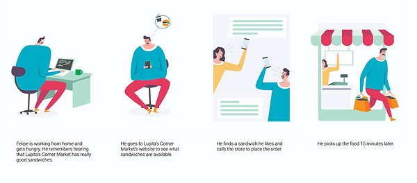
Storyboarding
We storyboarded what a scenario would be if a customer uses the new website to order and pick-up a sandwich from Lupita’s Corner Market. This helped us prioritize a simple user flow to achieve this task.
%201.png)
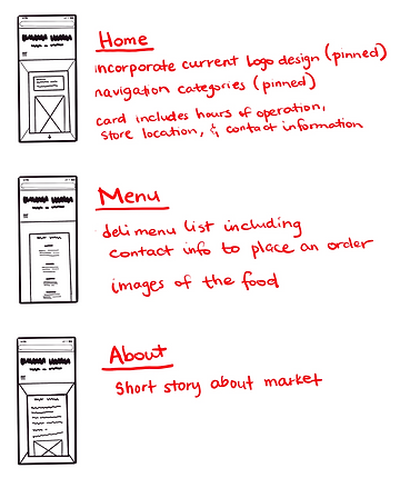
Initial User Flow & Wireframes
After storyboarding, we created a user flow diagram that includes navigation categories to address customer and client needs. We simplified the structure of the website to make it easy for shoppers to browse. We created wireframes based on this diagram for usability testing.
Usability Testing
We transformed our low fidelity wireframes into a digital prototype and conducted virtual usability testing to measure the success of our sketches.
We received positive feedback about the navigation categories, but needed to improve design flow.
Design Flow: Users mentioned that they would like to see what is on the deli-menu right when they land on the page so they can quickly decide if they want to order from the store.
Improvement: Make the menu instantly visible when you land on the page while still maintaining information about hours of operation and contact info.
Second Iteration
We took the constructive feedback we received in the first iteration and created a second user flow , wireframes and a new prototype. Below is a visualization of our changes and our thought process. They show the development of the website from the MVP to the second iteration.
.jpg)
.png)
Low-Fidelity Prototype (Mobile)
_pn.png)
Low-Fidelity Prototype (Desktop)
Brand Identity
We received positive feedback from the client and users after this iteration which led us to create a high fidelity prototype. We incorporated the market’s new brand identity by utilizing their redesigned logo and color palette from the market renovations.
04
Design
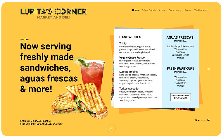
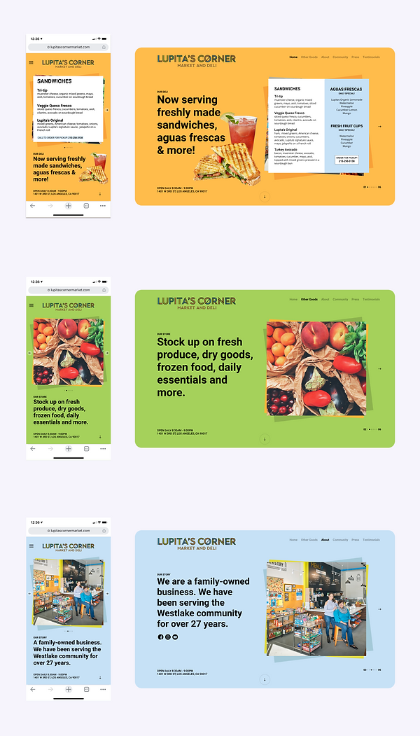
Hi-Fi Prototype
The image below shows our current design of the Home, Grocery, and About sections of the website.
With this design, we were able to successfully maintain a cohesive brand identity, provide customers with useful information about the store, and maximize customer engagement by giving the client an easy way to update her food and drink menu.
The product is a central shopping platform for local small businesses to showcase their products. This application would also help consumers explore small local businesses within their community while staying safe during Covid.
Consumers will be able to easily BOPIS multiple items from different local stores and track when their orders are ready to be picked up in-store or curbside - therefore eliminating delivery to increase profits for the small businesses
Conclusion
We have continued to iterate on the design and are excited to test and see its effectiveness. We hope the website will help drive more foot traffic to her store. We are continuing to work with Luz to have customers be able to order directly from the website.
